The American Ultimate Disc League has seen intricate, garish, revolutionary and rubbish designs over its 8 years. Amidst uncertainty over wether the league will go ahead during the COVID-19 pandemic, the new kit designs have been released that were intended for the 2020 season. We asked our fashion correspondent, M. Jeremy de Reer, to review the designs.
Detroit Mechanix – 1st
This is a gourgeous kit from the whipping boys of the league and is the only one to score full marks in the ratings. It has to be one of the all time greatest sports kits, for its bold but simple design. Well done Mechanix for this standout performance!

San Jose Spiders – 2nd
In number two spot is a simple, fade down design from San Jose. The white jersey is the only kit to earn 9/10, securing it in second place – perhaps I have a personal preference for the lights? Perhaps these top two are just excellent designs.

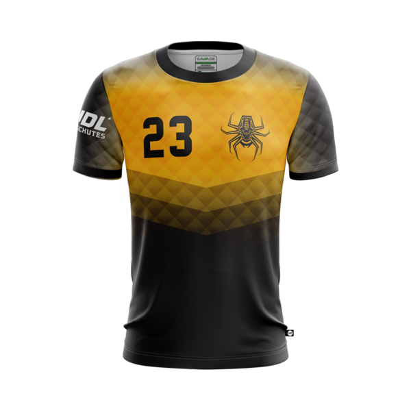
San Jose Spiders – 3rd
Narrowly – and somewhat controversially – following the light, comes the Spiders dark, on 8/10. The yellow and black combo is striking and the chevrons, pattern and colours are all fabulous components but don’t quite work to the same effect as the other kit.
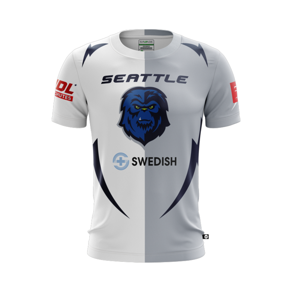
Seattle Cascade – 4th
You have to be bold to be near the top, and it seems that central vertical lines do you no harm either. Seattle have a very cool effect with the kit-of-two-halves. It’s a shame about their logo though…
Detroit Mechanix – 5th
Its so much better in white, and maybe the association helps this jersey out a bit – nonetheless they have a design you would happily be seen around town in. Well, except that it’s a Mechanix shirt.

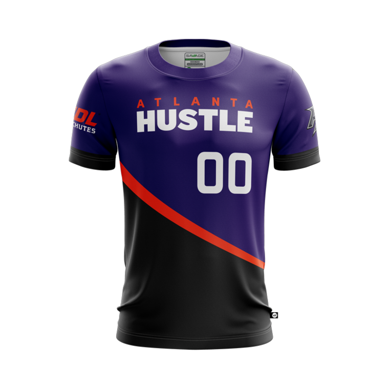
Atlanta Hustle – 6th
In direct contrast to the Mechanix dark, Hustle’s is not one you would wear casually. However, that is not the purpose, so despite the bold colour scheme this kit is the last of the ‘8’s.
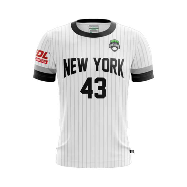
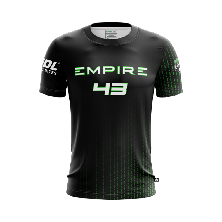
New York Empire – 7th
New York has been synonymous with a pin striped white Jersey thanks to the Yankees wearing it since long before the sport of Ultimate was even born. It’s a classy kit for the Empire to adopt.
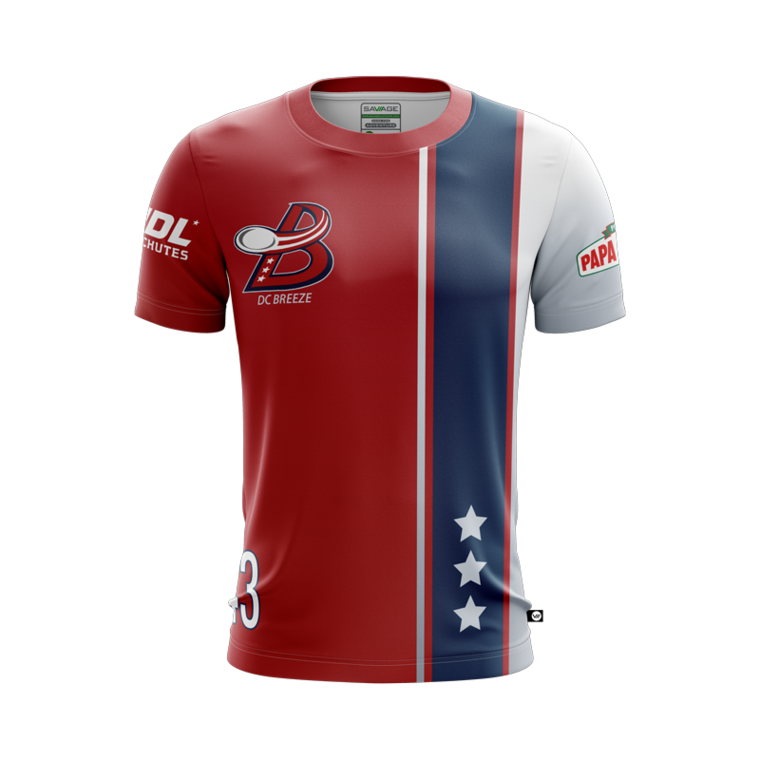
D.C. Breeze – 8th
Both Breeze designs – which are very similar – are a struggle. A clear distinctive shape is appealing, but this kit swings between that and tacky and almost cartoon-like. Fortunately for them, the former opinion has been used for these rankings.

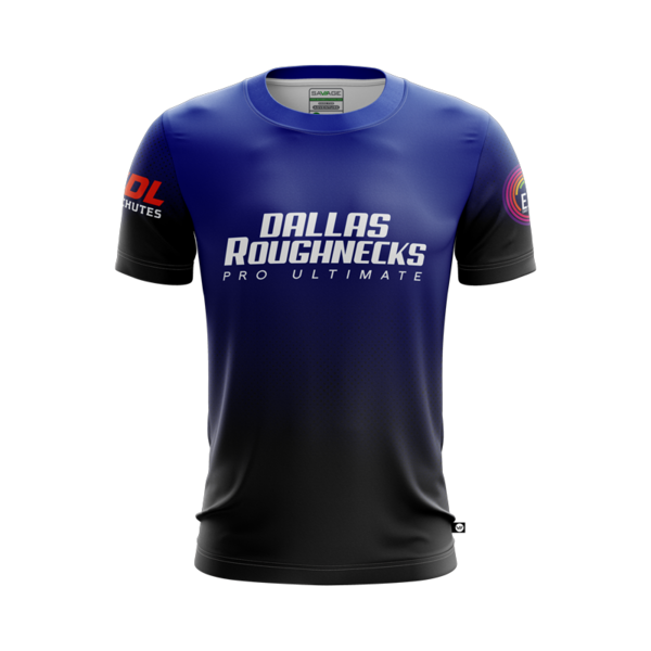
Dallas Roughnecks – 9th
The Roughnecks have certainly had better kits, but the rich colour combination on this blue will wear well as they join the geographically vast new East division.
San Diego Growlers – 10th
Think causual wear brands such as Diesel and this incredibly simple design, which is so well proportioned, earns its 6/10.

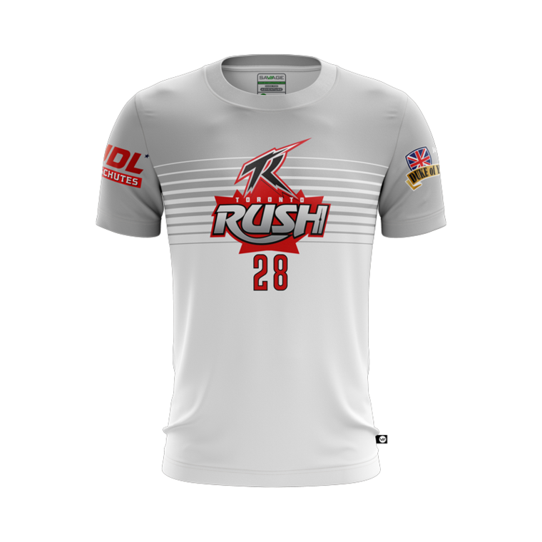
Toronto Rush – 11th
There are strong parallels between this design and the second-placed Spiders’ equivalent, but the execution is not as good in Rush’s instance. Nonetheless a good option.
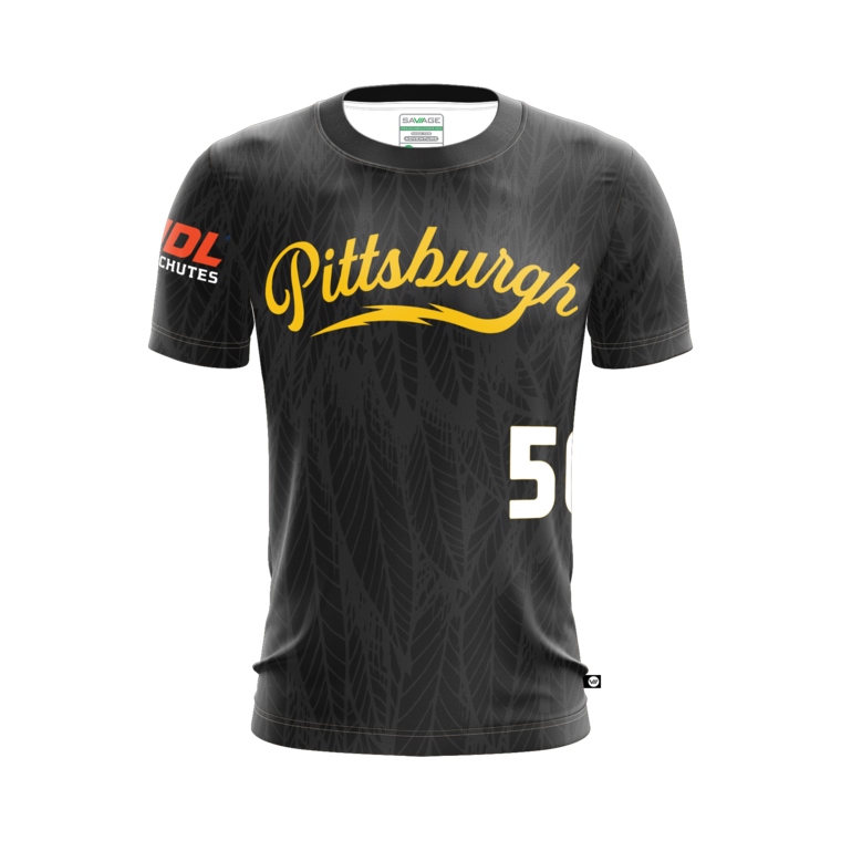
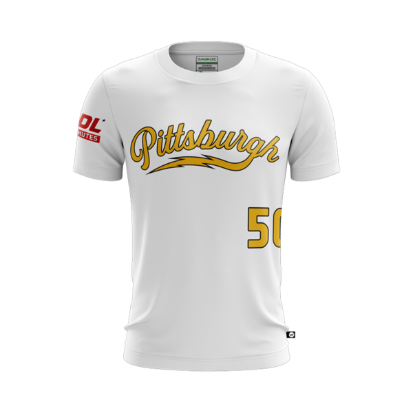
Pittsburgh Thunderbirds – 12th
The Thunderbirds are blessed with the prime colour combination of all the teams across the AUDL, so not much more is needed. They have gone with a simple name stamp in classic style, though I’m not sure what is going on with their background pattern. Perhaps this is needed to prevent the kit being too dull.
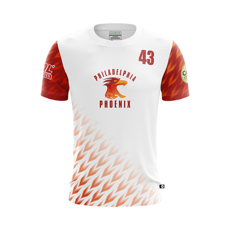
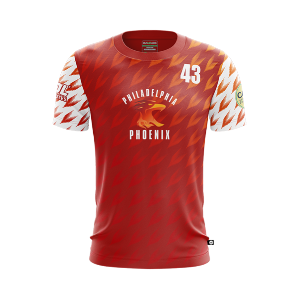
Philadelphia Phoenix – 13th
The pheonix kits are another challenge. The club has had some special – and certainly some better – jerseys in the past, so these come as somewhat of a disappointment. Nonetheless, the better of the two, the light, has a fine balance to it.
D.C. Breeze – 14th
Clear and simple, but as mentioned this kit is an opinion divider. Count yourselves lucky its sunny today, DC…
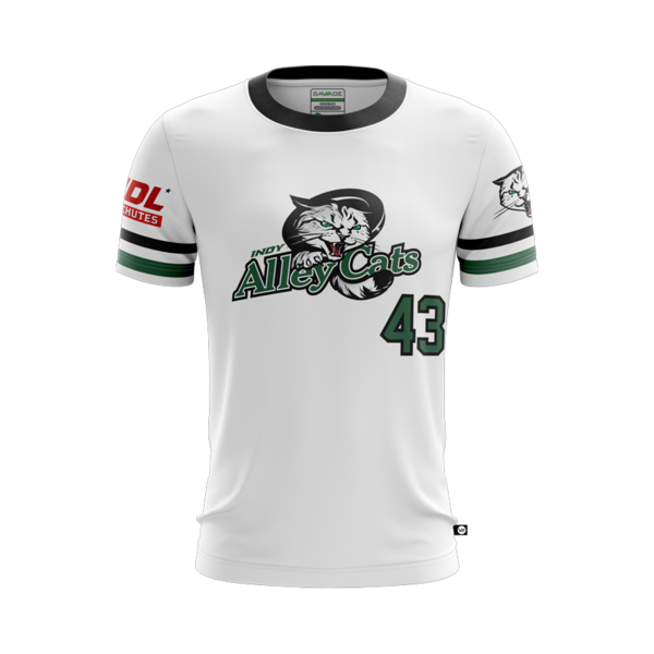
Indianapolis AlleyCats – 15th
Think classic US high school sweater – this is a no-frills design executed well. Admittedly it doesn’t sit higher due to its lack of complexity but this kit does absolutely fine.
Madison Radicals – 16th
The Mad Rads have channelled David Bowie for yet another year on their kits, and it’s a pretty cool look – its their slightly ropey colour scheme, more prominent on their home kit, that leaves their kit – unlike the three time all-AUDL finalists – solidly mid-table.
Dallas Roughnecks – 17th
Maybe its generous to put such a minimalist design, that looks like it could have been put together quicker than a pop up tent, amidst the mid-table. However, one man’s minimalist is another man’s clean and classy.

Montreal Royal – 18th
See above – the same person who couldn’t be bothered to design Roughnecks’ white clearly couldn’t be bothered to design Royal’s.

Madison Radicals – 19th
The Radicals are a great team with so much going for them. Although in a way it’s a shame they have done so well in the AUDL’s early years as it makes it hard for them to change this vomit-inducing, vomit-inspired colour scheme.

New York Empire – 20th
Empire have taken a font from an sci-fi film and printed their name on a plain black shirt. That’s an overall lack of imagination – their nice colour scheme drags them out of the dirt and to a ranking of 4/10.
Pittsburgh Thunderbirds – 21st
Much similar to the above comments for NY; however, as a pairing – something not included in rating the individual shirts – it is so much better to have a matching or at least parallel design.
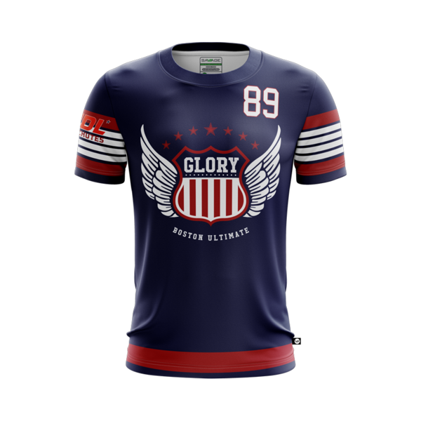
Boston Glory – 22nd
Boston are probably keen to grab some attention in their debut season in the league, but please: this is not the way to achieve that. The kit has some admirable aspects to it but they will be hoping that design features such as their dotted belt-line don’t scare off the star players living in their area. Its just enough to scrape them into the top half though.

Montreal Royal – 23rd
Not that the sash was great, but getting rid of half of it has not gone well. I can see the thought process but the fact is the jersey just doesn’t look that good.

Seattle Cascade – 24th
For their home kit, Seattle combine the regal colour scheme of the roughnecks’ dark with the highly ranked layout of their own light, and somehow generated a shirt that is far worse than both of them.

Toronto Rush – 25th
The colours are that of danger and the number of different design features on this kit combine with that to make an assault to the senses. Toronto – chill out and find a balance between your kits to put yourselves mid to high table next time. This kit is chaos.

Los Angeles Aviators – 26th
The aeroplane-and-field design is just not that good, as much as I personally would like it not to be the case. Presumably they were keen to move away from the Flyer’s branding of winged words. Fortunately the pattern does not stand out on this kit and you have a basic enough design thats acceptable. Scrapes in at 4/10.

Minnesota Windchill – 27th
This 3/10 jersey may or may not have belonged to Wolverine before it was adopted by Minnesota.

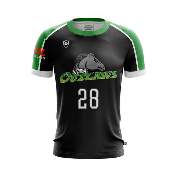
Ottawa Outlaws – 28th
A combination of garish colours and somewhat imbalanced proportions, along with a dated style of shoulder stripes, puts this kit officially low table.

Atlanta Hustle – 29th
This is a kit that may grow on you with time, but certainly when you first see it you have questions. Maybe the purple shade at the bottom is supposed to be reminiscent of Clifton Suspension Bridge…

San Diego Growlers – 30th
If you have a sensation of déjà vu, that will be because you have seen essentially this exact kit at dozens of tournaments on several different teams in the last 10 years.

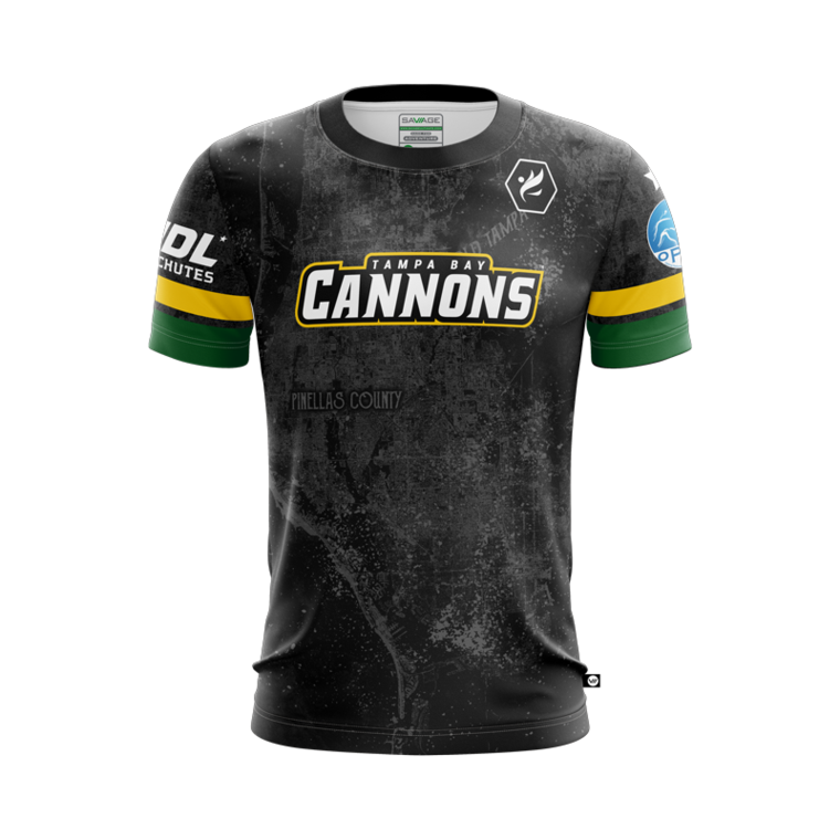
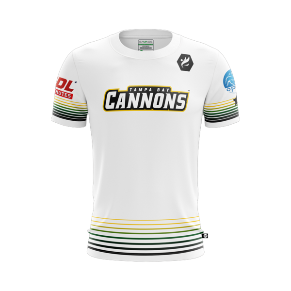
Tampa Bay Cannons – 31st
There is probably some sort of Florida reference going on in the funky sleeves, but it just does not suit the grey-smoke kit. Serious questions need to be asked.
Ottawa Outlaws – 32nd
Somehow the black-and-green is worse than the white-and-green colours on an uninspiring jersey performance overall by the Outlaws.
Minnesota Windchill – 33rd
An icy cold kit gets an icy cold reception. Potentially 2/10 is a harsh mark but this is a very uninspiring white jersey. Someone somewhere at Windchill must have recognised better options were available.

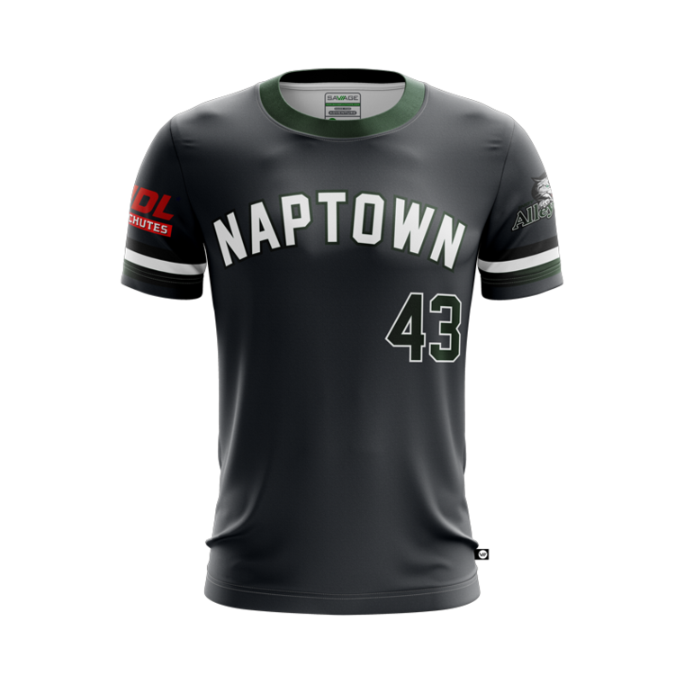
Indianapolis AlleyCats – 33rd
Who or what is Naptown? Regardless, inverting microsoft words basic colour scheme is a feable attempt to grab interest to this dull design.
Philadelphia Phoenix – 35th
Pheonix had some nice ideas for this jersey but combined them poorly. The sleeves alone are quite interesting but the clolours do not sit happily on the torso. Try again next year Pheonix but for now it’s a thumbs down from us.
Los Angeles Aviators – 36th
As with the home, the away pattern, drawn by someone’s three-year-old, is not good, but sadly stands out more boldly in these colours. Unlike Philly – don’t try again next year please LA, start from scratch.

Austin Sol – 37th
A Sol kit so generic, that this journalist had to look up who it belonged to. It looks like something from a football game that couldn’t afford to buy the image of the real team jerseys.

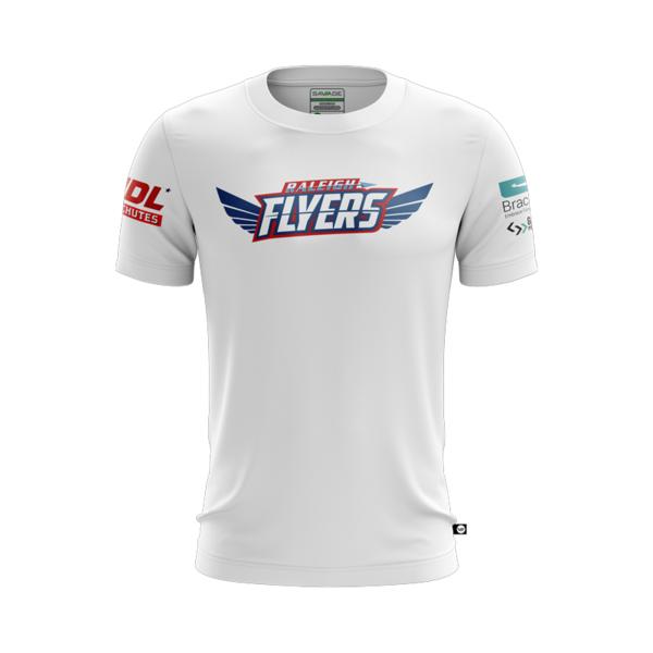
Raleigh Flyers – 38th
Its inoffensive, it really is. But it is so dull, and is no change on last years. As a Flyers fan myself, this is a source of great sadness to me.

Austin Sol – 39th
Incredibly more plain than their home kit, Sol’s light earns them 2/10 despite its bottom up fade. And yes – I know that the other plain-white-with-bottom-up-fade-and-logo shirts got in at 17 and 18, but this jersey is absolutely worse than those, due to the sizing balance and colours.
Boston Glory – 40th
Boston Glory’s efforts to be brave with their jersey design may deserves commendation, but sadly the outcome was this teen casual wear from the early noughties, except less cool. Glory have some work to do to become fan favourites after their dissappointing start in kit release.
Raleigh Flyers – 41st
How infuriating is it that Flyers have decided to go with just a single logo? Maybe it’s 1/10 rating comes from a personal frustration but this kit could be an iron-on transfer paper job in someone’s garage. As it features only the logo. They may think it classy, but it is better termed dull.
Chicago Wildfire – 42nd
This home kit only beats the white thanks to an appealling shade of blue. Nothing else works for it, it’s plain but without any redemption via that simplistic satisfaction that plain kit designs often have.

Tampa Bay Cannons – 43rd
Having been so scathing about the Flyers away kit, the Cannons’ option serves to remind us that it can be worse than blank. They forgot some of the colours of the rainbow stripes at the bottom of this unsettling new design but it still somehow avoids bottom of the pile. 0/10.
Chicago Wildfire – 44th
What a pleasure it would be to lay into a kit designer’s ill judgement in their ambition on the worst rated kit in the AUDL. Sadly, Wildfire have taken away that joy by producing a dire, dreary and dull kit, presumably designed to induce sleep in their opponents and thereby win games. If you see a real wildfire, leave this jersey in it.

